Crack a Pack MTG with Bruce
#27 DTK Art Draft
By Bruce Gray – Casual Encounters
Hi everyone and welcome back to Casual Encounters. Today I am going to do something that I haven’t done in a little while. I have fairly regularly cracked a pack and gone through what I would be looking at if I were starting a draft, but today I’m going to crack that pack and look at for the ART. I call it my Art Draft and today I’ll be busting open a pack of Dragons of Tarkir. Let’s not waste any time, let’s get down to business and see what is in the pack!
Commons:


Uncommons:


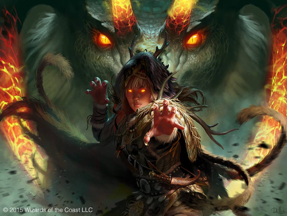
Rare:

Have you ever really looked at the art on Qarsi Sadist? Have you? It is pretty amazing art on a card that is very marginal. The act of sacrificing the man on the altar is pretty detailed, but it is the masks of the guys pinning him down that are pretty chilling. These would be the type of ornate masks I would expect to find right out of some horror movie and are frightening while beautiful. However, look closer. Who’s is that in the background? Yeah, that is Silumgar. I don’t think I’ve ever actually noticed because my eyes get pulled to the masks in gold and the white shroud on the victim, but therehe is lurking in the background. That’s crazy neat. I may not be a big fan of the card, but I’m on board when it comes to this card in terms of art.
Sabretooth Outrider is a fine piece of art where the art is essentially exactly what you were expecting. You get a big cat, plenty off red on account of the colour of the card and generally a pretty predictable card. Heck, I can even account for the first strike because of the lances they are carrying. This is just fine on a card that is also just fine, but no one is getting excited. The white in the background is kind of whitewashing the whole piece, the art is reasonably predictable, and nothing remarkable really stands out. This is just fine, but nothing more.
Champion of Arashin is a little more interesting. The hound in the foreground is very interesting and highly detailed if you look at the armor he’s wearing. The background is also pretty interesting with the other hounds joining the battle as well. However, the real winner here is the fact that they sneak Dromoka into the background breathing a big gout of flame. This is more my style.
Atarka Beastbreaker looks pretty bland to me. Sure, he’s pretty jacked but that is hardly noteworthy. The colors and contrasts are once again kind of washed out and there really isn’t much happening. By comparison, the Champion of Arashin is on the midst of a battle, while this guy is coming home dragging supper behind him. This really isn’t anything super cool even if the card is a fine little card for a draft deck.
Mystic Meditation offers us far more in terms of visual eye candy. The colors are a little sharper and the detail feels like it is just a notch above what we’ve seen done in the other cards. Look at the dragons above the figure in the center and tell me those aren’t detailed portrayals of dragons. The gold steamers coming down from the ceiling look to be floating, further capturing the moment that looks like “mystic meditation” so that the art truly matches the card. I think the aspect that really pulls me into this card is the quote from Narset in the flavor text. I’m a huge fan of this fairly simple card draw spell because the art totally appeals to me.
Butcher’s Glee is one of my favorite combat tricks in the set and art is almost as good. That little goblin just looks so funny coming lunging at you brandishing that huge machete. The big toothy smile says all I need to know about this goblin and what it is feeling. I also really like that the action shot is up close. The close up perspective adds an emotional dimension that reinforces the panic for the card, much like you might feel if you are the one trying to cast this. You don’t want to have this spell fizzle so the sense of panic is real. The flavor text is also pretty neat as we get to know a little bit more about the the little goblin Kneecleaver. I’m just a fan on the whole and feel like the emotion in the card art matches the emotions I feel as I play the card.
Ojutai Interceptor is one of those card that had me excited when the set dropped because I like the art, but I’m less thrilled with it now. Sure, the morph like cloud behind the bird is pretty cool looking but there really isn’t much else to look at. There is a monastery appearing faintly in the background, but even that can not save this card. The bird in the foreground just doesn’t look like much because even the colors are a little muted. Sadly, this one has slipped down my list of card art preference and is much lower than it was a few months ago.
Herald of Dromoka has a lot more of what I like. The foreground is a highly detailed character in mid action which is a good start. The background is very interesting as well with a pile of soldiers leaving the temple on the left hand side of the card frame. They are clearly in a rush because the fortress is under assault. The right hand side of the card frame is a huge Dragon trying to bbq the fortress. My only real complaint with this card is the horn. It just looks so ridiculous right there in the middle of the card. I think the piece of art would have been more powerful with a different horn, but they were looking for a common thread to tie this to the Abzan from Khans of Tarkir. However, I still feel like it looks a little silly and detracts from the rest of the cool art.
Segmented Krotiq is a pretty gross looking centipede but it’s the sheer size of that thing is what’s so neat. Underneath the Krotiq is a monastery of sorts and it is absolutely dwarfed by the size of this gigantic creepy crawley. While I appreciate the proportions of the bug, I’m not hugely enamoured by the art and wouldn’t be putting this super high on my list.
Tail Slash is one of my favorite removal spells from the set but I can’t say the same for the art. The portrayal of the dragon doesn’t seem to match with the images we’ve seen elsewhere in the set. It feels like this has been pulled out of a book on dinosaurs because it looks like a brontosaurus with wings rather than an honest to goodness dragon. Apparently this dragon also got a 2-for-1 out this deal based on the two guys being launched in nearly identical positions. No, I can’t get behind this art even if the spell is very solid removal.
Echoes of the Kin Tree looks like it is a poster for the Hobbit. The relative positioning of the figures in the foreground look like they have been taken right out a movie. Their uniforms are dull to start with and dulled further as our eyes are pulled to the ghostly figure in the background. The art does a good job of conveying the significance of the card because it becomes clear that spirits are supporting the living warriors of the Dromoka brood. The best part for me is the flavour text about the human warriors maintaining their tradition of worshiping the Kin Tree despite Anafenza being executed. This card is reasonable and the art is pretty, but the positioning of the characters on the card feels very cliche.
Dromoka’s Gift is much cooler. I think what appeals to me is the vantage point as you look up, past the soldier being rewarded, up at the face of Dromoka. This feels like the moment is pretty momentous and should be something to take note of. Sadly, the card itself doesn’t match the grandiose art, but we aren’t here to quibble about spells are we. Based solely on the art, this is something that I like and enjoy seeing. If only the spell itself was slightly better.
Self-Inflicted Wound is a grisly card if I’ve ever seen one. Our eyes are drawn to the man in the foreground and the anguish he is experiencing as he fights against himself to try and prevent harm. However, what is interesting is the combination of the corpse in the lower right of the card frame in purple mist and the pair of matching purple cloaked wraiths in the background in the top left. This man clearly has no hope and The Reaper is clearly coming for him. This is chilling and grisly art to say the least and something that is interesting to examine more closely.
Clone Legion is pretty cool simply because of the mirror factor that has matching forces on each side. This feels like a flavor success in the truest sense of the word because the art and name show almost exactly what the card says it does. When art, name and card all match life for the players is made easy and things make sense. When either the card art or the name don’t match, players get confused. Don’t believe me? Check out a card like Tormented Soul or Orchard Spirit which clearly floats because it is a spirit or wraith. It can’t be blocked except by a creature with flying. However, they themselves don’t fly. That’s something that newer players don’t always remember because both of them LOOK like they should be flying. Well, Clone Legion is a win because if you look at the name and look at the art you can get a really good sense for what the card does.
Top 5 picks
My first pick is going to be the creepy art on Qarsi Sadist. The detail in the masks and the fact that Silumgar is lurking in the background pushes this over the top for me in this pack. This wasn’t the best art pack I’ve ever opened, but there certainly were some pretty reasonable choices. I always like looking at the art on these cards and this was fun today.
Thanks for stopping in to have a read! Have yourself a great MTG day!
By Bruce Gray – Casual Encounters
@bgray8791 on Twitter
